PowerTrack 3.0 Navigation
PowerTrack is AlsoEnergy’s flagship application. It is a powerful and versatile web-based app for commissioning, monitoring, optimizing, and controlling portfolios of solar energy plants. PowerTrack is an industry leader that has been trusted by users for many years.
Early during my tenure at AlsoEnergy, I was tasked with making significant UX improvements to PowerTrack as we prepared to launch PowerTrack 3.0. One of the most significant projects for that effort was updating the complex app navigation.
Role
UI/UX Design & UX Research
Date
2021
Client
AlsoEnergy
Background
Problem
When I started at AlsoEnergy, PowerTrack 3.0 was still in beta. PowerTrack had been around for nearly 15 years at this point and had a large user base. PowerTrack is a complex app that has equally complex navigation needs. The official release of PowerTrack 3.0 was coming up in a few months, and the navigation was a major pain point for beta users. There wasn’t enough time to overhaul the navigation, but usability improvements were desperately needed before release.
On top of this, before I started, there was no dedicated UX design team for the app. This was my first project at AlsoEnergy, and one of the first projects for the UX team. This was a chance for the team to prove the value of design at a company that never had it before.
Goals
Empower users to confidently navigate PowerTrack’s many pages
Help users understand where they are currently in the app
Design a navigation that is intuitive to new users
Design a navigation that is familiar to legacy users
Demonstrate the value of the newly formed UX Team
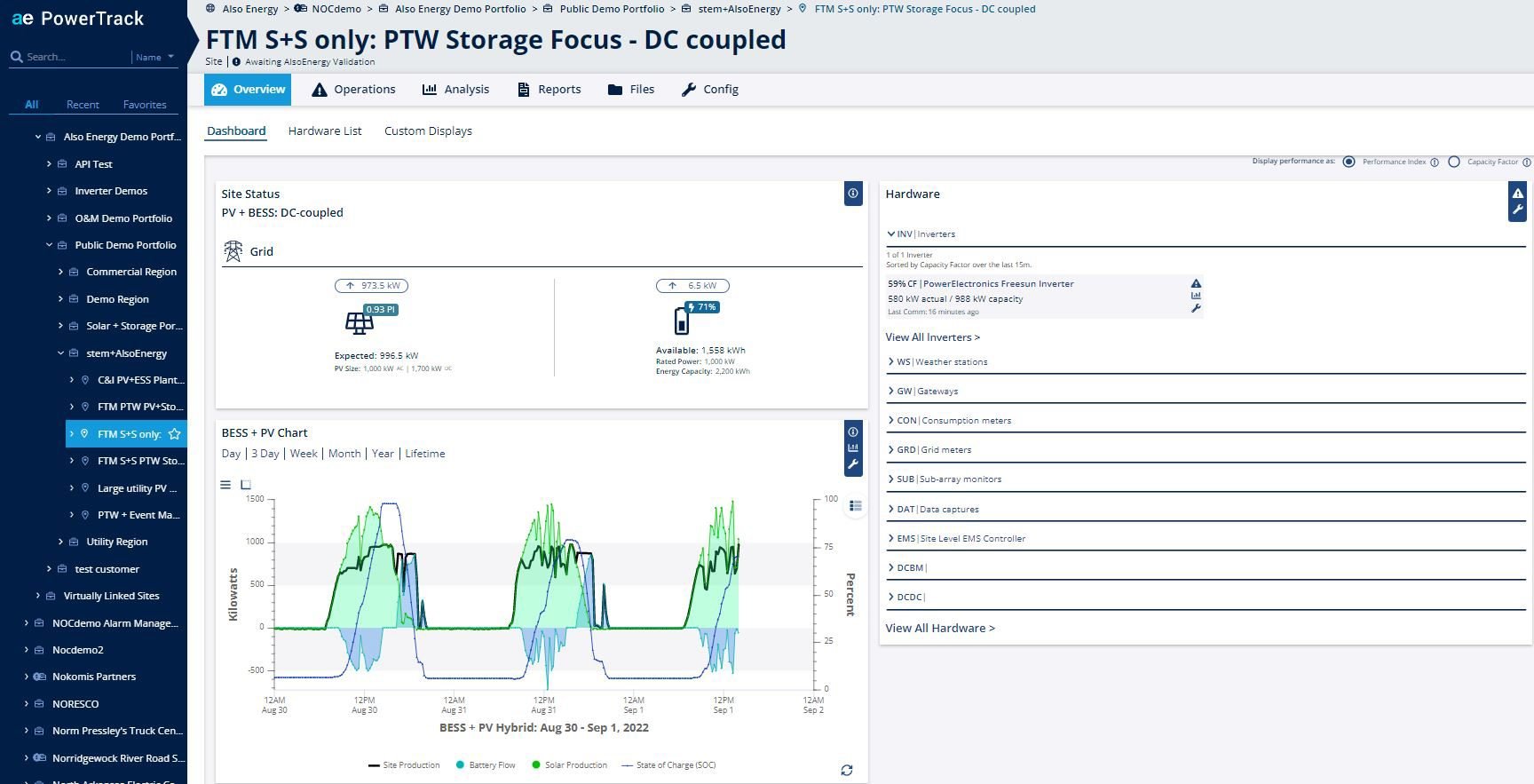
PowerTrack’s 3.0’s navigation design in beta
Courtesy of AlsoEnergy
The Project
PowerTrack has countless views and complex pathways between them. This complexity makes for a complex navigation. In PwoerTrack, there are four levels of navigation: The Navigator, the Toolbar, the Views, and the Sub-Views. The navigation works in a cascading way, where what you select in one level affects the options in the lower levels.
The Navigator
The navigator is the first level of navigation in PowerTrack. This is where the user makes their first navigational decision: what solar site or portfolio of sites do I want to see? This decision has downstream effects on what is available in the lower levels of navigation.
One of the biggest usability problems with the old design was users did not understand the hierarchy of the navigation levels. This is a major usability issue, but we were able to overcome it with some visual design changes. I chose an inverse color scheme from the rest of the UI (i.e. light text on dark background vs. dark text on light background) to make the navigator standout. I also made it take up the whole left-hand side and used an arrow to illustrate its relationship to other navigation elements.
PowerTrack 3.0’s new navigator panel highlighted on the left
Courtesy of AlsoEnergy
The Toolbar
Next to the navigator is the page header that contains three important sub-components: the breadcrumb, the header, and the toolbar.
The breadcrumb shows the path to the current site or portfolio selected in the navigator. Each item in the breadcrumb is a link so users can quickly jump up a level if needed. In our research, we found this was an important navigation pattern for users in PowerTrack 2.0. Legacy users really appreciated its inclusion.
The header shows the title of the current site/portfolio. This didn’t exist in the previous iteration of the 3.0 navigation, where users were unclear what they were looking at. This helped both new and legacy users understand where they are in the navigator.
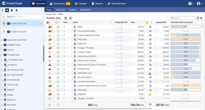
The toolbar is the most straight forward of the navigation levels. It shows the six main tools in PowerTrack and the options never change. However, putting below the other elements was important improvement over the old 3.0 navigation because it makes it clear that this is secondary to the navigator panel.
PowerTrack 3.0's toolbar highlighted at the top
Courtesy of AlsoEnergy
The Views
The third level is the views within the each of the tools. This level has dynamic options that change based on what’s selected in the navigator and toolbar. Because of this, it’s important to make sure this level is less impactful, visually, than the other two levels.
The view options are always visible as tabs at the top of the page so they are discoverable for new users. However, we also included these options as drop downs on the toolbar because legacy users expected to find them there.
PowerTrack 3.0's views highlighted at the top
Courtesy of AlsoEnergy
The Sub-Views
The final level of the navigation is the optional sub-views list. We chose to place it on the right hand of the screen to make it visually subservient to all other levels and to avoid cluttering the page content.
PowerTrack 3.0's 4th level highlighted on the right
Courtesy of AlsoEnergy
The Process
This navigation project was one of the first for AlsoEnergy’s new UX team. The release for PowerTrack 3.0 was coming up soon, and the navigation was one of the biggest pain points for beta users. The navigation needed a lot of rework, but there wasn’t time for a complete overhaul.
In the relatively short timeline we had, we were able to conduct six usability tests. Three were with the AlsoEnergy Support Team who represent the legacy power user persona for PowerTrack. These users need to work quickly to resolve numerous customer issues any given day. These users care about efficiency and familiarity. We also tested with three users who work for AlsoEnergy’s external customers. These users spend a lot of time in PowerTrack, but not as much as our support team. These users care more about ease of use and understanding what they are looking at than speed and efficiency.
Below, you can see some designs from those usability tests that didn’t balance the needs of all our types of users.


