Unified Dashboard
Stem’s Athena Portal contains several apps for monitoring and controlling renewable energy sites. However, the platform did not have a single place where users could see an overview of how their portfolio’s performance. I stepped in to help find a solution to this problem that would also serve as the face of the Athena Portal going forward.
I worked with both Athena users and internal stakeholders on this high profile project. The biggest challenge was to create a simple experience that summarizes complex data and directs users to the correct app.
The final result is a simple, yet effective, interface that allows users to quickly skim through their portfolio, take a closer look at a problematic site, and then launch into a more complex workflow elsewhere in the Athena Portal.
Role
UI/UX Design & UX Research
Date
2023
Client
Stem, Inc.
Background
Problem
The Athena Portal has several specialized apps to track the status of renewable energy sites. Each app allows a user to look at their portfolio of sites through a different lens, such as financial, solar production, or energy storage performance. However, there was no way to get a generalized overview of how the sites were doing. Each app had an independent site list and a user would have to click on sites one-by-one to check their vitals. This made for a tedious experience.
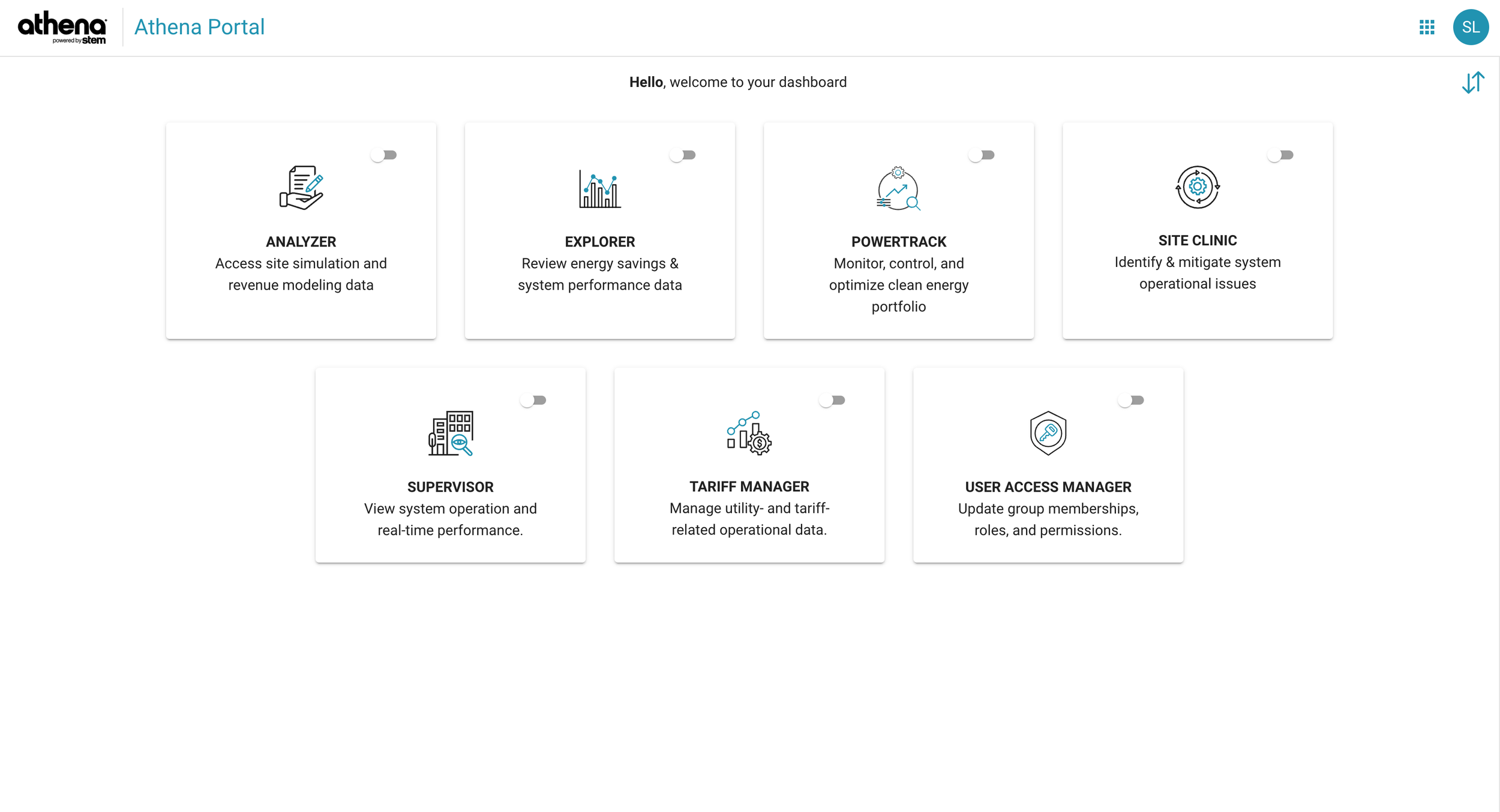
On top of that, the Athena Portal homepage did not provide much value to users as it was just a bunch of links to the other apps. There was nothing on this page to direct a user towards completing a task or retrieving important information.
Goals
Provide an overview of site performance to the user
Present valuable KPIs to users
Help users find problems in their portfolio
Direct users to the right app from the dashboard
The Athena Portal’s original dashboard
The Project
The target persona for this dashboard was the technical asset manager. These users are responsible for managing the day-to-day operations of a renewable energy site. To help them find problematic sites in their portfolios, we provided a site KPI table and a details panel with useful visuals to explain the KPIs.
Site KPI Table
The technical asset manager persona typically checks in on their portfolio of sites once or twice a day. During this check-in, they’re looking for sites that are having problems. To facilitate this workflow, we provided a data table that shows the user the most important KPIs for a site that the user can sort. This way, they can quickly identify sites that are outliers for any given KPIs.
The KPIs are divided into two categories: solar and storage. These are main two types of sites that Athena supports. While a given site can have both solar and storage components, users tend to thing of these as separate systems. So, we grouped the KPIs by those types to help paint a picture of that system. By displaying both groups on the same table, the user can also see how both systems are doing simultaneously.
The new landing page for the Athena portal with site KPIs from across the platform.
Details Panel
Once the user has zeroed in on a site, they need a deeper understanding of what is going on. The site details panel allows the user to get that next level of detail without navigating away. Because the Athena Portal has several apps, the user might not know where they need to go to address the issue.
In the side panel, users can find charts showing how the solar array and battery storage system are performing in the last 72 hours. They’ll also find KPIs for the most important pieces of hardware for these systems.
From here, the user can quickly jump off into a more complex workflow to address the problem. The goal is to provide just enough information at this stage to help the user select the right workflow.
The site details panel provides extra details on the site and directs the user to the correct app to address the problem.
The Process
The two biggest challenges for this project were establishing the best workflow for our users and figuring out what data they need at this high level summary view. This is why user research was essential to this project. Internal stakeholders had their own ideas on how these pieces would look, but the users didn’t always agree.
From interviewing technical asset managers, we learned about their day-to-day workflows and what problems needed to be solved in Athena. We found that these users typically check-in on their portfolios once or twice per day to see where the problems are. This steered us in the direction of providing an experience optimized for exception-based monitoring, rather that showing aggregates and averages across a portfolio.
From there, we asked users about what data they find the most valuable in a summary. We found users had a clear idea of what they wanted to see for solar but not so much for storage. Energy storage is a much newer technology, so users across the industry were less familiar. To compensate, we worked with internal stakeholders to undersatnd how energy storage systems work and what KPIs are the most important. This first draft will provide users the visibility they need, and will serve as a starting point for users to give us more feedback as they learn more.
Below, you can see a few iterations of the dashboard that came from this research process.
The results of a data point card sorting exercise with users


